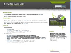
 As some folks know, I worked with Huw Wilkins on the new redesign of the Twisted site. Huw did the design, CSS etc., and I hacked around on trac to make his vision work within that framework. He made my life very easy, though, as he produced the entire design to fit perfectly within trac.
The new Twisted site has been a success -- we're getting many more visitors and they are staying longer than ever. I believe that the design and the improving info architecture are the most significant contributors to this. And after seeing these changes and the assumed enjoyment that folks are deriving from them, all I could think was "This was so easy to do, there's no excuse not to have a good-looking trac instance."
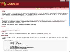
 Having been inspired by Huw's great design for Twisted, I did the same thing for The Zenoss internal trac instances. I had a great time doing this, having explored a lot with the Twisted site redesign. What's more, with the use of the trac dev branch (forth-coming version 0.11) the Genshi templates really simplify the process. With the process I had established with the Twisted work and the Zenoss work, I was have the courage to update my own massive number of trac projects: 3 domains with each one being a trac "multi-sites" setup.

People don't realize how quickly you can take a generic trac and have something quite unique. Here's all you need to do:
- install Genshi and 0.11 Trac from subversion
- design your look and feel and then prepare your images
- edit the trac.css file
- update the site.html and layout.html Genshi template files
As an example, I've put the trac customizations in subversion here.
Technorati Tags: design, software, web
2 comments:
Great post, thanks for the quick info on skinning out Trac. I just installed it tonight for a new project, and I'm glad this is available. Thanks.
Hey Jeremy,
Glad it was useful and that you liked it :-)
Post a Comment